![]()
March 26, 2019 – Stock market timing strategies have been around since the dawn of markets. They are utilized to forecast trends, from bear markets to bull markets, and everything in between. The goal in using stock market indicators is to be fully invested in bull markets and to side-step the drawdowns during bear markets.
The problem with stock market indicators is that if these indicators worked reliably, then every market participant would use them. In a pari mutuel system such as the stock market, in which the dynamic pricing of the stock market changes the odds as people trade, the mere act of all participants utilizing the same forecasting system would render it useless.
With this in mind, let’s take a look at a number of stock market indicators that have been used in the past.
Dividend Yields vs. Bond Yields
Between 1928 and 1958, the S&P 500 consistently yielded more than the 10-year Treasury bond, typically 2% – 5% more. At this time, it was expected that ownership of common stocks was risky and a yield greater than government bonds was necessary to entice investors to go out on the risk curve and buy equities instead of treasuries. When dividend yields were higher than bonds, own stocks. When bond yields exceeded dividend yields, own bonds.
In 1958, the yield on the 10-year bond exceeded that of the S&P 500 for the first time on record. Some investors would have taken this as a market timing signal to get out of stocks and put their capital into bonds, waiting for the market to “normalize”, in which the yield on stocks would once again exceed the yield on bonds, to jump back into stocks.
But any investor relying on this stock and bond yield market timing strategy would have been waiting a long time, given that it took about 50 years for the 10-year bond yield to once again dip below the dividend yield of the S&P 500.
Obviously staying out of stocks for the period from 1958 to 2012 would have been a poor decision, making this stock market indicator unreliable.
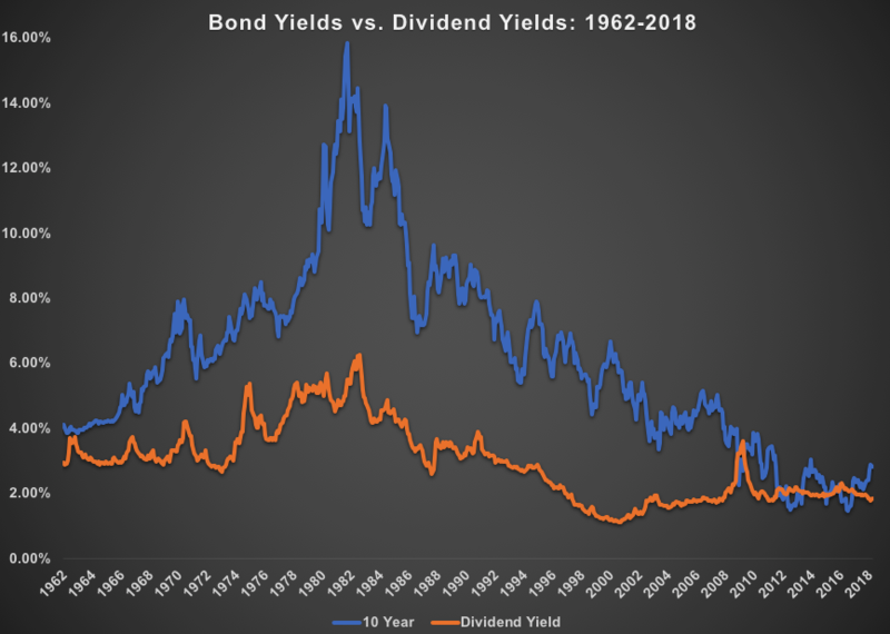
Source: Bloomberg
The Buffett Indicator
The Buffett indicator compares the total market capitalization of U.S. stocks, as measured by the Wilshire 5000, compared to U.S. GDP.
This ratio compares the total value of publicly traded stocks to the country’s economic output, with the theory that there should be a relationship between the two. When stocks are valued at a small portion of economic output, own stocks as they are cheap. When stocks are valued at a large portion of economic output, do not own stocks as they are expensive.
Warren Buffett used this measure often, claiming “it is probably the best single measure of where valuations stand at any given moment”. His key market cap / GDP rule, as discussed in a 2001 Fortune article, is:
“If the percentage relationship falls to the 70% or 80% area, buying stocks is likely to work very well for you. If the ratio approaches 200%–as it did in 1999 and a part of 2000–you are playing with fire.”
Buffett shut down his initial investment partnership in 1969, once the market cap / GDP indicator exceeded 80% for the first time.
The ratio came down significantly through the brutal bear market in the early 1970’s and remained below the 80% threshold until 1995.
However, once the market cap / GDP indicator again crossed 80% in 1995, it never looked back. If an investor would have taken this signal to sell stocks, as Buffett did in 1969, they would have been out of equities over the past 24 years, missing out the 700%+ total return of the S&P 500 over that time period. Note that Buffett’s Berkshire Hathaway remained very invested in stocks over this period, ignoring his indicator for a gain of almost 1,200%.
For this signal to once again drop below 80% and prompt investors to stampede back into stocks, the equity index would have to drop -42% from its current level. Certainly, within the realm of possibilities, but I wouldn’t hold your breath.
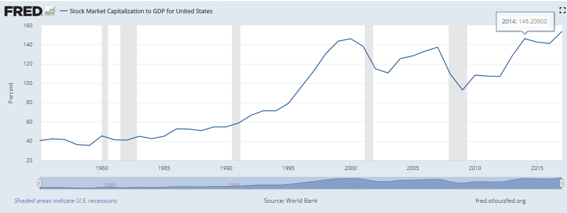
Source: Federal Reserve Bank of St. Louis
CAPE
The cyclically-adjusted price to earnings ratio, or CAPE, is a valuation measure that averages real earnings per share over a 10-year period to generate a smoother, long-term earnings profile.
Prior to 1995, the CAPE ratio averaged 15x, oscillating around this mean with a low of 5x in 1921 and a high of nearly 35x in 1929.
The CAPE ratio crossed the 15x pre-1995 long-term average in 1995 and didn’t subsequently cross below that mark save for a brief moment during the depths of the global financial crisis in 2008-2009.
The CAPE ratio is another stock market indicator that would have largely kept investors out of the market since 1995.
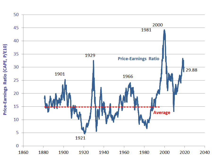
Source: Robert Shiller
On a personal note, in 2011, the CAPE ratio crossed 23x to the upside, a level exceeded only during 1929 and the tech bubble of 1999-2000. I was concerned that valuations were stretched, as the market had rallied hard for a number of years coming out of the great recession and bear market of ‘08.
Given these stretched valuations, I thought the timing was right to launch an event-driven arbitrage fund, a hedge fund strategy that can perform well irrespective of stock market performance. It was a strategy that I felt could generate positive performance even if the markets declined.
I launched this strategy in January 2012 and over the subsequent years, my concern regarding stock valuations turned out to be unfounded. The markets continued to rally over the next 7 years. Not only did the CAPE ratio not decline, it actually went up an additional 32%. The CAPE ratio currently sits at 30x; double the pre-1995 average.
Baltic Dry Index
During the global financial crisis of 2008-2009, one key leading economic indicator that emerged was the Baltic Dry Index.
The Baltic Dry Index (BDI) is a composite of freight shipping rates and is regarded as a general shipping market bellwether. It was thought to provide insight into where the global economy was heading.
From 2006 to 2008, the BDI rallied alongside global markets. When the global financial crisis struck and stock markets dropped around the world, the BDI also plunged.
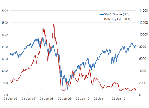
Source: Bloomberg
After both the BDI and stock markets recovered markedly in 2009, the BDI began showing weakness in 2010. Was this leading indicator correct in telling investors that the stock market was heading for a decline?
Nope. Turns out the BDI stopped working that year due to a deluge of ships being delivered, decimating shipping prices and dragging the shipping index to new lows over the next 9 years.
10-Year Minus 3-Month Yield Curve
The yield curve, measured as the difference between 10-year treasury bond yields and 3-month treasury bond yields, is an indicator that many market participants have their eyes on these days as it recently hit a key level.
In a well-functioning market, the yield spread is typically 1-3%, reflecting the spread that investors need to compensate them for the risk of holding longer tenor bonds.
It is only when the yield curve inverts, or when long-term 10-year yields drop below that of short-term 3-month yields, do warning bells start to ring. The yield curve just inverted for the first time since 2007.
The reason that a yield curve inversion is meaningful is that this indicator preceded all nine U.S. recessions since the 1950s, save for one false positive in 1966. Its track record in predicting recessions has been quite good over the past 65 years.
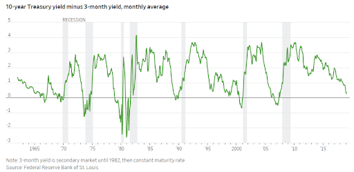
Source: Wall Street Journal
Recessions typically beget significant stock market declines and many investors try to utilize a yield curve inversion to lighten up their stock market exposure in order to side-step any subsequent declines.
One note is on timing – the inverted yield curve doesn’t have a great track record of indicating when a recession will commence. Historically, the yield curve has inverted anywhere from 7 months to 24 months prior to a recession starting.
What To Do About It
Stock market history is filled with leading indicators, most of which have a spotty track record. Investors and traders have long relied on many of these to try to make short-term forecasts, with mixed results.
The recent inversion of the yield curve is a yellow flag for investors. Rather than exit all of your stocks, which has its downsides (taxes, timing, missed opportunities, etc.), investors should get comfortable with their asset allocation, the risk in their portfolio, and the potential downside should a bear market hit. Remember that recessions and drawdowns historically have been temporary and markets typically recoup their losses on their way to all-time highs, albeit sometimes after long periods, so a long-term mindset is imperative.
No stock market indicator is perfect. However, they are worthwhile to pay attention to. Take note of what they say and proceed with caution.
-Julian